
Maté tea
Klijent:
Oro Verde
Date:
February 13, 2024
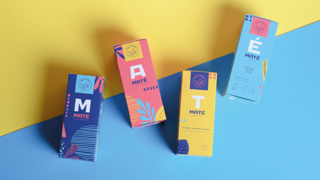
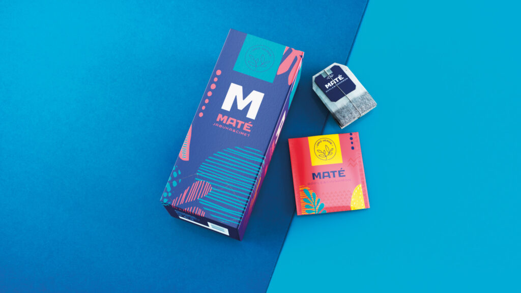
Creating a unique packaging design for four different blends of Maté tea – Maté Classic, Maté Chamomile, Maté Ginger and Orange, Maté Apple and Cinnamon – was a challenge. It was essential to simultaneously highlight the specific flavors of the products and establish Oro Verde’s position as a new brand in the tea market.
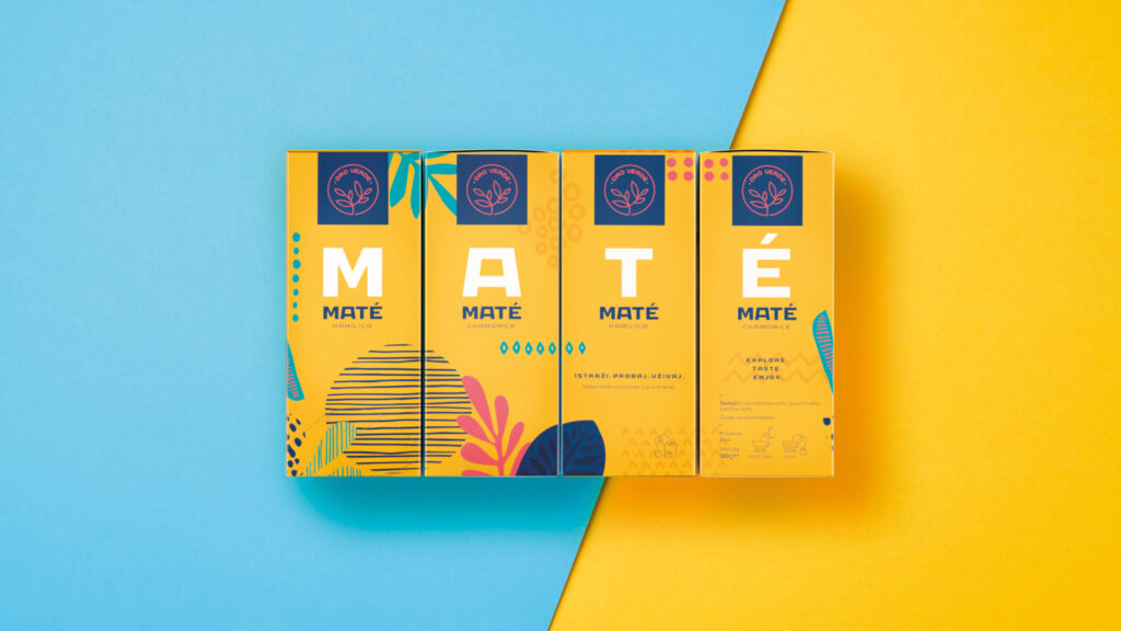
We analyzed the competition on the shelves of local stores and realized what we did not need. We decided to move away from traditional green tones and photorealistic illustrations. Instead, we used an unconventional and vibrant color palette, combined with a flat and minimalist illustration style. To catch consumers’ attention on the shelves, we smartly utilized bold typography. Each side of the box featured a large letter from the word MATÉ. When four boxes are placed side by side, they create a unique display space for the MATÉ products.
The result of our efforts was the successful launch of the product on the market. Maté tea became a hot topic in the hot beverage market in Bosnia and Herzegovina, and our innovative packaging attracted consumer attention and ensured a successful start for the Oro Verde brand.
February 13, 2024
Fill out the form and we will contact you shortly.
Fill out the form and we will contact you shortly.